
Job Analysis, Reimagined:
Accessible, Branded & Stress-Free
Redesigned a job analysis platform to create a more intuitive, efficient, and user-friendly experience. Focused on streamlining workflows, enhancing navigation, and improving usability to better meet the needs of its users.
Client
Team
Duration
4 months, Sep 2024
Tools Used
Figma
Microsoft Copilot/Azure
Context
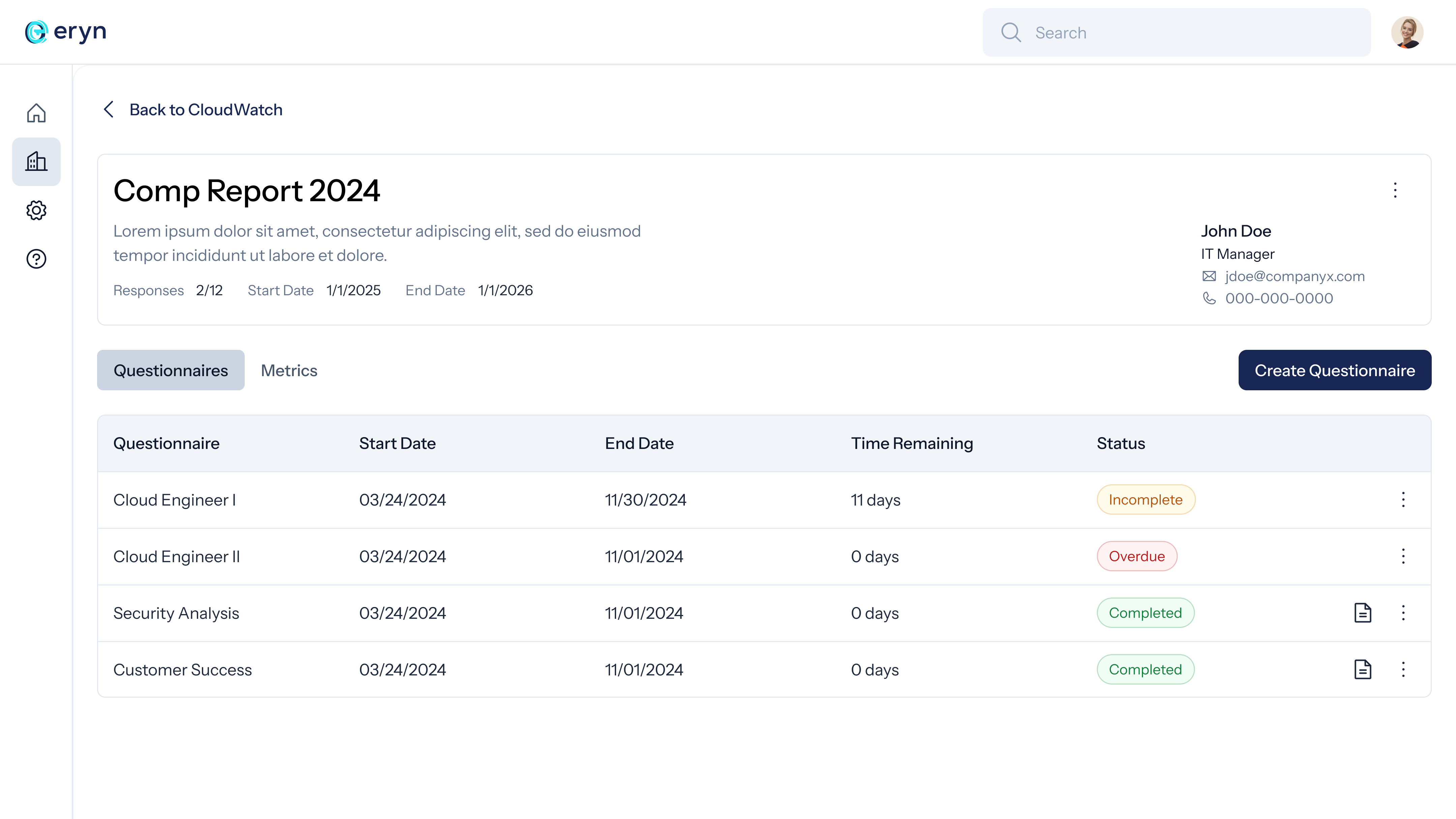
Eryn is an AI-powered job analysis platform built for compensation consultants, helping them streamline pay strategy decisions. It includes job analysis questionnaires, benchmarking tools, organizational analysis, and company dashboards, making compensation planning more efficient and data-driven.
Situation
Users perceived Eryn’s job questionnaire feature as a test, making the process of gathering information unnecessarily stressful for users. Additionally, the platform’s interface lacked accessibility, consistency with brand identity, and overall usability. This undermined the tool’s intended purpose of streamlining job analysis and delivering a seamless user experience.
Design Process
Current System Audit
Heuristic Evaluation
Usability Testing
Personas
HMW
User Flows
Wireframes
MS Azure Copilot Integration
Design System
Prototype
Usability Testing
Understand
This phase was focused on gathering insights, analyzing the current system, and identifying key user-experience problems.
Current System Audit
We began the redesign process by thoroughly auditing the existing Eryn platform to identify usability issues, accessibility gaps, and areas of inconsistency with the brand. The audit involved documenting each screen of the platform in FigJam, a collaborative design tool, and annotating the issues directly on the screenshots.
Heuristic Evaluation
As part of the design process, I conducted a heuristic evaluation of the existing system using Jakob Nielsen’s 10 Usability Heuristics. This method allowed me to systematically assess the platform for usability issues and areas of improvement.
Below is a summary of the evaluation:
- visibility of system status
- recognition rather than recall
- match between the system and the real world
- flexibility and efficiency of use
- user control and freedom
- aesthetic and minimalist design
- consistency and standards
- help users recognize, diagnose, and recover from errors
- error prevention
- help and documentation
Usability Testing
To further understand the pain points and usability issues in the current system, I conducted usability testing with 3 participants. The primary task was to complete the job questionnaire by answering questions about their current roles.
The following feedback regarding the respondent experience was unanimous among all participants, highlighting key areas for improvement:
Uncertainty About Recorded Responses
3 out of 3 users were confused about whether their responses were being successfully recorded.
Preference for Typed Responses
3 out of 3 users expressed a strong preference for having the option to type their answers instead of using the asynchronous audio recording system.
Perception of a Test-Like Experience
3 out of 3 users felt the questionnaire resembled a test, causing unnecessary stress and discomfort during the process.
Define
In this phase, we focused on synthesizing the data from the Understand phase to clarify the problems and outline specific design goals.
Personas
To guide our design decisions, we developed two key personas: the Respondent, who completes the job questionnaire, and the Consultant, who uses the platform to analyze and act on collected data. These personas helped us tailor the experience for both roles effectively.
How Might We
We centered our redesign around two core How Might We (HMW) questions to address the distinct needs of both Eryn’s key user types:
For Respondents:
How might we make the questionnaire experience feel more conversational and engaging, minimizing the stress of completing it?
For Consultants:
How might we streamline the platform's interface to enhance usability and efficiency in data analysis?
User Flows
We mapped out the user flow for both respondent and consultant roles. This process helped us visualize user pathways and identify potential friction points in their experience.
Wireframes
In Figma, we created mid-fidelity wireframes to outline the structure and layout of the redesigned platform. They served as the foundation for the high-fidelity designs that followed.
Develop
In the Develop phase, we focused on bringing our ideas to life through prototypes and iterative design refinements.
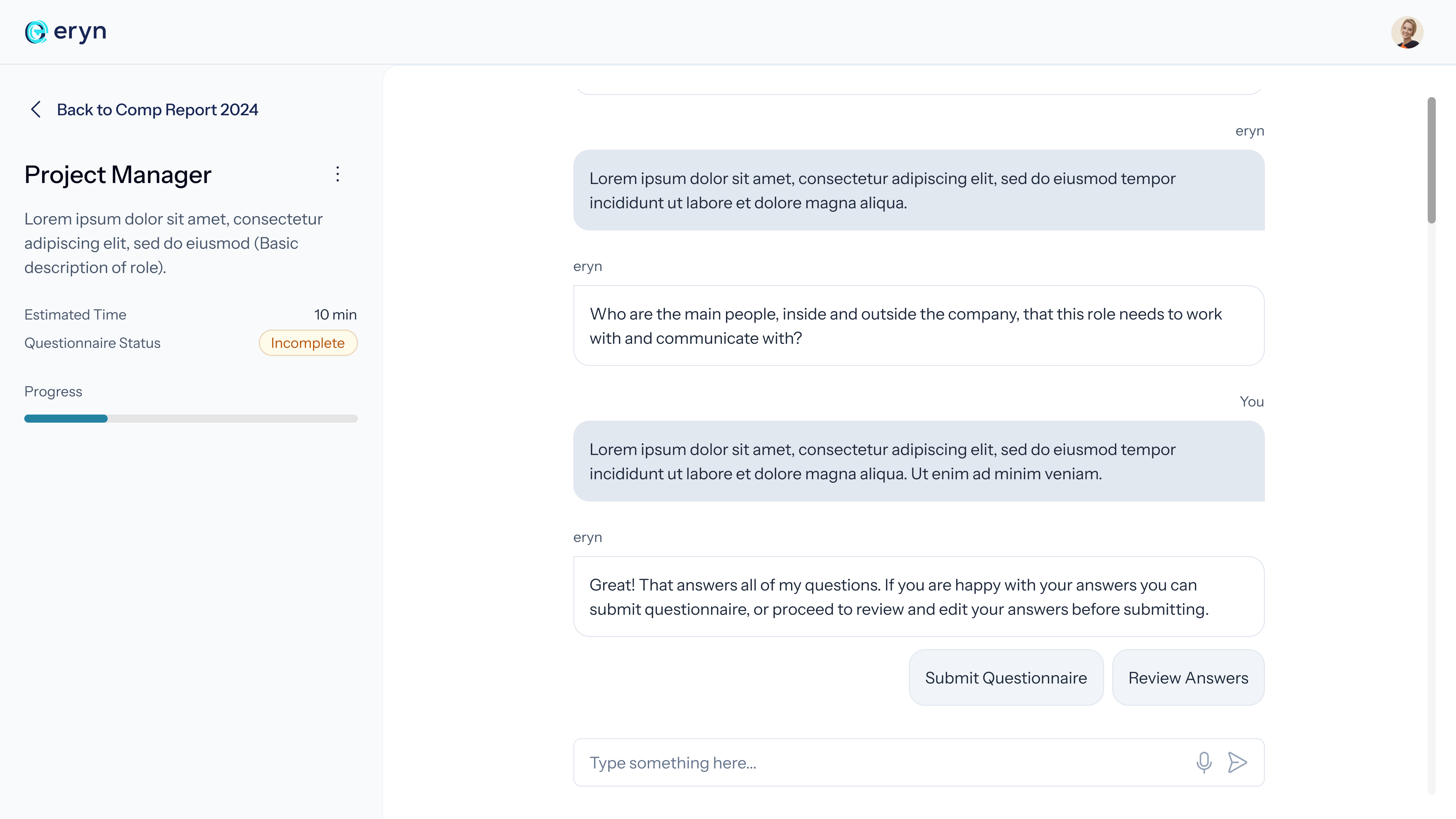
We sought to address user perceptions that the job questionnaire felt like a test. To create a more familiar and engaging experience, we decided to explore a chatbot interface—a format users often associate with casual, conversational interactions.
MS Azure Copilot Integration
To start the Develop phase, we utilized Microsoft Azure Copilot to design the logic for a chatbot-style questionnaire. This process helped us understand the system’s capabilities and informed subsequent design decisions.
Below, you can see the actual chatbot interface where users answer a series of questions, helping us categorize job roles and gather necessary information.
Here is a snippet of the code that powers the chatbot, showing how the responses trigger the Copilot logic:
					actions:
    - kind: SendActivity
      id: sendActivity_soLzRa
      activity: Hi there! I am  eryn and I am here to gather some info about your job.

    - kind: Question
      id: question_ChYQkI
      interruptionPolicy:
        allowInterruption: true

      variable: init:Topic.Var1
      prompt: What is the job title and what does it do?
      entity: StringPrebuiltEntity

    - kind: Question
      id: question_VH3Wum
      interruptionPolicy:
        allowInterruption: true

      variable: Topic.Var2
      prompt: Do any employees directly report into this role?
      entity: BooleanPrebuiltEntity

    - kind: ConditionGroup
      id: conditionGroup_5fzKe7
      conditions:
        - id: conditionItem_Aiwhk6
          condition: =Topic.Var2 = false
          actions:
            - kind: Question
Design System
A comprehensive design system was developed to ensure consistency across all aspects of the Eryn platform. This system included standardized UI components, color palettes, and typography, enabling a cohesive user experience. This laid the foundation for scalable future design work and streamlined the overall design process
Prototype
Using the wireframes as a base, we developed an interactive, high-fidelity prototype. This prototype closely resembled the final design, including updated visuals, navigation, and flow. It allowed us to test the new interface with users, gather feedback, and make necessary adjustments.
Validate
In the Validate phase, we tested our high-fidelity prototype with real users to ensure the redesign addressed the pain points identified earlier.
Usability Testing
We conducted usability testing with 4 users who matched the target audience. The goal was to assess how easily they could navigate the new interface, complete tasks, and provide feedback on the redesigned questionnaire feature.
The insights gathered from these sessions were synthesized and analyzed using Miro to identify key patterns and refine the design further.

Takeaways
1. Early Assumptions Can Be Misleading
Throughout the design process, we realized that our assumptions about user needs and behaviors were not always accurate. Testing with target users only at the end highlighted crucial areas where our understanding was incomplete, teaching us the value of validating assumptions earlier in the process.
2. Collaboration and Validation
Regular collaboration with stakeholders and final testing with users helped us confirm that the redesign met both business goals and user needs.
3. Opportunity to Contribute Beyond UX
In addition to focusing on UX, Beixi and I had the opportunity to work on various other aspects of the project, including creating sales materials, infographics, and diving into technical components like understanding Azure Copilot’s capabilities. This broad involvement strengthened our overall contribution to the project and expanded our skill sets.